Using the Theme Drawer
The Theme Drawer helps you style your entire page with a unified look and feel. These settings control the background, text, and accent colors across your layout, and affect how certain sections render. Here's a breakdown of each option.
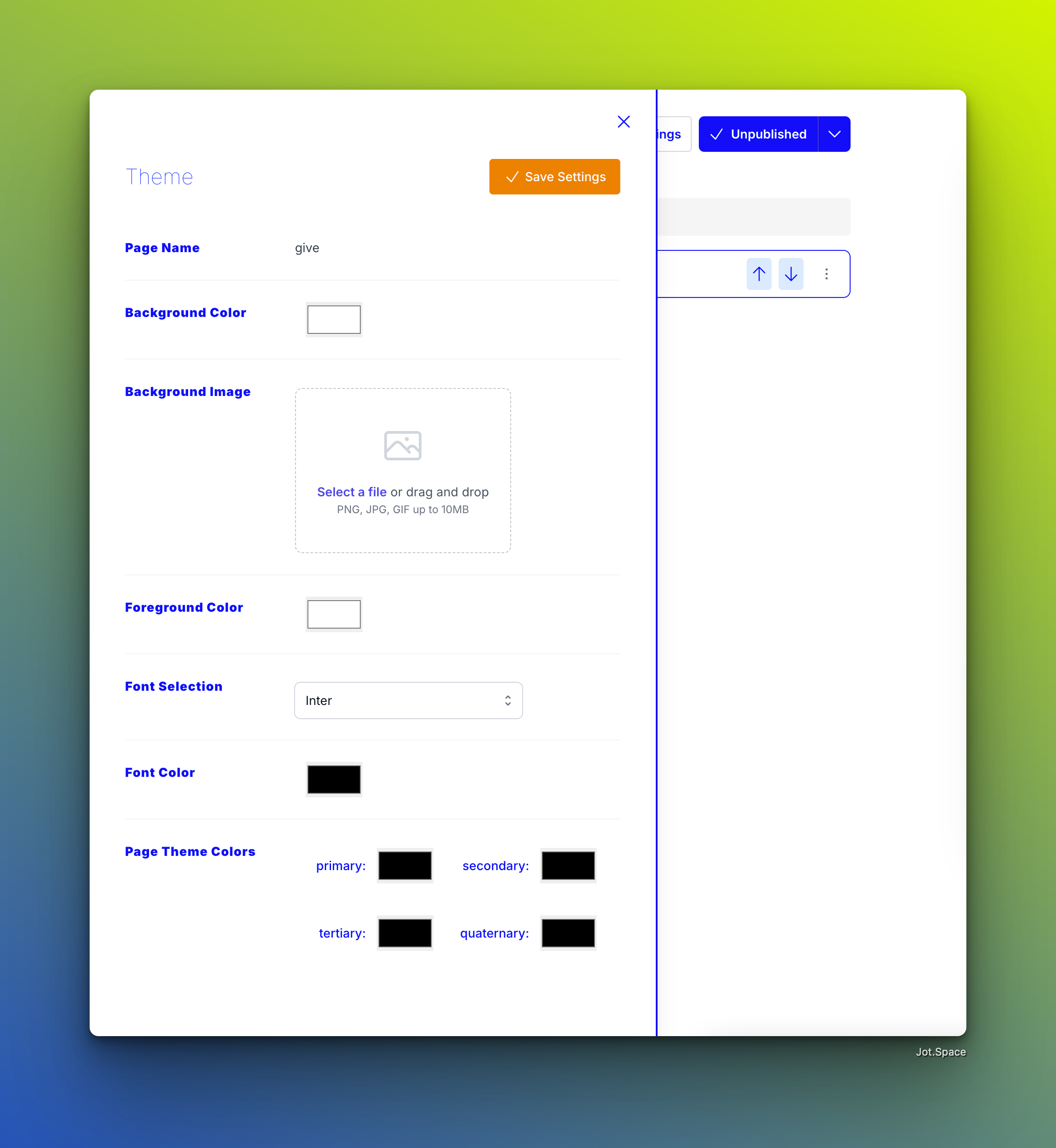
1. Background Color & Background Image
You can set a background color and optionally add a background image. If a background image is provided, it takes priority and will appear behind all content.
Tip: For better performance and design cohesion, we recommend matching your background color to the image’s average tone. This ensures a smoother experience for users with slower connections who may see the background color before the image loads.
2. Foreground Color
The foreground color applies to card-based sections. Think of it as a secondary background — it adds depth and contrast for elements that sit “on top” of the base background.
Many premade Jot sections use this foreground color to create visual layering and separation between content blocks.
3. Font Selection
Choose from a curated list of Google Fonts to apply a consistent typographic style across your entire page. Once selected, the font is applied globally, making your layout feel professional and cohesive.
4. Font Color
Set the font color for all text across the page. This includes headings, paragraphs, and buttons unless overridden by section-specific styles.
5. Theme Colors
There are four customizable theme colors: Primary, Secondary, and two additional accent colors. These colors are referenced within Jot sections that are tagged as theme-compatible.
These sections inherit most of their styling from your theme settings, giving you a unified, brand-like appearance with minimal effort. While this sacrifices some per-section customization, it ensures visual harmony throughout the page.